
Best Practices for Shopify App Listing Images
Use 1600×900 UI-first screenshots, short overlays, and mobile‑readable text to boost Shopify app installs.
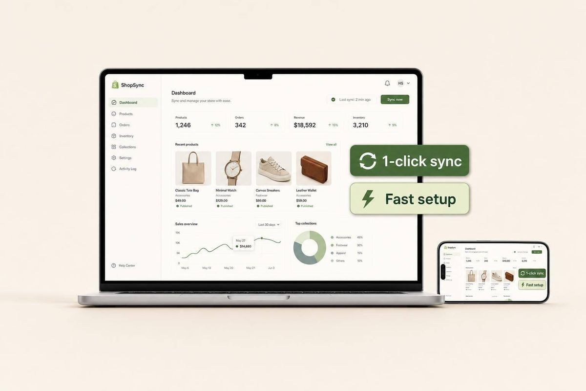
Your app images should explain the app in seconds. If I had to boil this guide down, I’d say: use 1,600 × 900 px images, show the actual app UI, make each screenshot do a different job, keep text short, and check every image on mobile before I publish.
Here’s the short version:
- I use a 16:9 layout for the cover image and all screenshots.
- I show the product screen first, not just a logo or graphic.
- I make image #1 state the main outcome right away.
- I keep overlay text to a few words and avoid covering key UI.
- I make sure text is readable at about 200–300 px wide on a phone.
- I avoid pricing, hype claims, repeated screens, and old UI.
- I test one image change at a time and watch CTR, installs, rankings, and uninstalls for 2–4 weeks.
A few numbers matter most:
- Shopify wants 3 to 6 desktop screenshots
- Each screenshot should be 1,600 × 900 px
- File uploads can be up to 20 MB
- For loading speed, I’d keep cover images around 200 KB to 500 KB
- Good mobile text sizes are about 24–32 px for headlines and 16–18 px for support text
If I’m updating a listing, I treat the image set like a short sales flow: cover image = what the app is, screenshot #1 = main result, screenshots #2–#6 = proof and workflow. Then I compare before-and-after data using Shopify App Store optimization tools to see if the change helped.
This article is about making those images easier to understand, easier to read, and more likely to turn visits into installs.
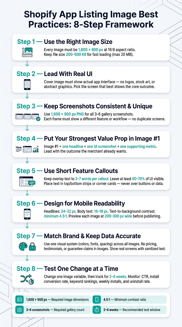
Shopify App Listing Image Optimization: 8-Step Visual Framework
What Shopify Merchants See First in App Listing Images

Before a merchant reads your app description, your visuals have already done part of the talking.
When performing Shopify App Store keyword research, In search and category results, merchants first see the app card: icon, name, subtitle, rating, and price. Screenshots only show up after they open the listing.
Once they land on the detail page, the cover image sits right at the top. The screenshot gallery comes next. Shopify now puts screenshots closer to the top of the listing, which means those first frames carry more weight than they used to. The first one or two screenshots get prime placement, especially on mobile.
The cover image tells merchants what the app is for. Screenshots back that up with real UI, dashboards, and settings. Shopify requires 3 to 6 desktop screenshots, and each one must be 1,600 × 900 px (16:9).
| Asset | Placement | Primary Job |
|---|---|---|
| Cover image | Hero area, top of listing | Communicate the main value proposition |
| Screenshot #1–2 | Immediately below hero | Show core UI and key workflows |
| Screenshots #3–6 | Gallery carousel | Provide supporting feature detail |
On desktop, the cover image and first screenshots often show above the fold. On mobile, the cover image and screenshot #1 can take up most of the screen. So if your text overlays, UI elements, or data points are hard to read at that smaller size, merchants will move on.
That constraint changes how you should design from day one. It’s the difference between a listing that gets attention and one that gets passed over.
That is why the next section starts with cover image size and 16:9 layout.
sbb-itb-ce93587
1. Use the Right Cover Image Size and 16:9 Layout
Shopify’s app store best practices set a clear standard for cover images: 1,600 × 900 px at a 16:9 aspect ratio. That size matches Shopify’s cover placement and shows up cleanly on both desktop and mobile.
Once you have the canvas right, the next step is simple: make the image easy to read at a glance.
A 16:9 layout helps a lot on small screens. It uses the full width on mobile without making merchants scroll just to figure out what they’re looking at. And that matters, because people usually scan app listings fast, not slowly.
Keep the design tight. Use:
- one clear focal point
- a simple background
- strong contrast
Your cover image shouldn’t look like a feature collage. Too much going on, and the message gets lost. Keep text under 10 words, and don’t push it too close to the edges. If Shopify crops the image on different screen sizes, edge text can get clipped.
File size matters too. Shopify allows images up to 20 MB per file. But for cover images, it’s smarter to stay around 200 KB to 500 KB so the image loads fast.
Before you publish, check how it looks on mobile. If merchants can’t read it in a second or two, it’s probably too busy. Next, make that canvas work with a real UI-focused cover image.
2. Lead With a Real UI-Focused Cover Image
Start with the right 16:9 canvas, then put the product front and center. Shopify wants the cover image to show the app's UI and features - not a logo, stock art, or an abstract graphic. A real interface tells merchants what the app is at a glance instead of making them piece it together.
Pick the screen that best shows what the app does, how it works, or the result it gives. If it's a review app, show the request flow. If it's an analytics app, show a clean trend chart. Skip empty settings screens. They feel like filler, not proof.
Use your brand colors and typography to frame the interface, but keep the UI in the middle of the story. Heavy text, badges, and decorative overlays pull attention away from the product. They also get tough to read at smaller sizes. The brand should support the screen, not stand in for it.
Next, keep the screenshot gallery consistent, distinct, and easy to scan.
3. Keep Screenshot Sizes Consistent and Unique
After the cover image, the screenshot gallery needs to carry the pitch.
Use Shopify's 1,600 × 900, 16:9 PNG format for every gallery screenshot. When every image uses the same size, the gallery displays more cleanly across devices. That makes it easier for merchants to scan each frame without visual clutter.
Shopify also prohibits duplicate or near-duplicate images. So each screenshot should show one separate feature or workflow: dashboard, automation, product review tools, and so on. Every frame should answer a different merchant question, which helps the gallery move the story forward instead of saying the same thing twice.
The sweet spot is a consistent template with different UI content. Keep the same fonts, colors, and spacing in every image, but show a different in-app screen in each frame. That gives the gallery a steady look while also giving merchants a clear reason to keep scrolling.
Once the gallery structure is set, the next step is making image #1 carry the strongest value proposition.
4. Put Your Strongest Value Proposition in Image #1
Image #1 is the most important spot in your gallery. It has one job: tell people what the app does and why they should care right away.
So lead with a clear outcome, not a generic brand graphic. If you're selling a product add-ons app, that might be something like "Increase average order value with smart upsells" next to a clean cart UI with a "+ $18.75 AOV" label. The point is simple: meet the merchant at the problem they're already trying to fix before they have to zoom in, scroll, or read your description.
Accuracy matters more than polish here. If image #1 shows a mockup that doesn't match the live UI, or makes claims you can't verify, it can get flagged during review. Shopify's guidelines lean toward honest, UI-first images - especially in that first slot. Using a real screenshot with a short benefit overlay helps you stay within those rules and can cut down on revision cycles.
Keep image #1 tight:
- One headline
- One UI screenshot
- One supporting metric
Use the rest of the gallery to back up that promise with feature-specific images.
5. Use Short Feature Callouts Without Covering the UI
Once image #1 has set the main promise, use the rest of the gallery to back it up with short callouts. A feature callout is just a brief label that explains why the feature matters without getting in the way of the product itself. Keep each one to 3–7 words. And keep each image focused on one idea: one callout, one part of the UI. That way, the point is clear at a glance.
After the copy is short enough to scan fast, place it where it won't cover the interface. Use empty space like a top strip, bottom strip, or a small corner card that stays away from buttons, charts, and key data. If the callout sits on top of a button, chart, or key metric, move it. Leave at least 60–70% of the UI visible so merchants can recognize the interface right away and feel sure that what they're seeing is real. The callout should support the gallery story, not take it over.
Match each callout to the feature shown in the image. Don't put pricing in overlays. Skip claims like "#1 app" and guaranteed outcome lines like "+30% sales." Instead, use benefit-led copy such as:
- Sync inventory across all channels
- One-click theme backups
Readability matters just as much as the words themselves. Use strong contrast so the callout is easy to read on mobile. A simple test helps: if you can't read it in two seconds on an actual phone screen, the font size or contrast needs work. Keep the same font, weight, and placement across the gallery so every image feels like part of the same system.
6. Design Every Image for Mobile Readability
Short callouts only help if people can read them on a phone. And that matters here, because most Shopify App Store traffic comes from mobile. So every image needs to stay clear on a 5–6 inch screen.
The rules are simple: use 24–32 px headlines, 16–18 px supporting text, and keep text-to-background contrast at at least 4.5:1. Dark text on light backgrounds works well. White text on a dark overlay works too.
One common mistake is squeezing full desktop screenshots into 16:9 image frames. On mobile, that turns into a wall of tiny details. Instead, crop in and zoom on the single UI panel or feature that matters most in that image.
If you're showing a revenue metric, make the number big and easy to scan. Something like "+$12,500 revenue" or "+18% conversion" with clear labels reads in a second. A packed dashboard with multiple charts and tiny axis labels does not.
Before you publish, preview each image at 200–300 px wide or check it on an actual phone. If the main headline is hard to read, increase the size or improve the contrast.
Readable images also need to stay in line with the app's brand.
7. Match Your Brand While Keeping Data Accurate
Use one visual system across the full set: colors, typography, spacing, and layout. That way, the listing feels like your product and stays easy to scan. Keep the color palette tight and limit type styles so everything feels consistent. A simple move is to pull one accent color from your app icon and use it in callout bars or borders. But the UI should still do most of the talking.
Branding helps, but it can't change what the merchant is seeing.
Don't put stats, pricing, reviews, testimonials, or guarantee claims in images.
Show real screens and write captions that match what the image shows. Use sanitized test data only. Never show customer data.
A good rule of thumb: keep brand treatment in borders, headers, and callouts, not on top of the UI itself.
Once the set is branded and accurate, test image changes to see if they improve mobile app builder rank and installs.
8. Test Image Updates Against Ranking and Install Data
Change one image element at a time - the cover image, screenshot order, or caption style - while keeping the title and description the same. That’s the only way to know what actually moved the needle.
Use a 2–4 week test window. Ranking shifts can show up in about 7 days, but 30-day trends give you the clearest read.
Track these metrics, using Shopify app analytics to monitor performance before and after each image update:
| Metric | What It Tells You |
|---|---|
| Keyword rankings | Whether visibility improved or dropped |
| CTR from search results | Whether the new images attract more clicks |
| Listing conversion rate | Whether the listing converts better after the change |
| Weekly installs | Whether installs are growing week over week |
| Uninstall rate | Whether images set accurate expectations |
What does a good result look like? Not one big day. You want a steady lift across more than one metric.
If CTR goes up but installs stay flat, the cover image may be getting attention without showing enough value once people land on the listing. If installs go up but uninstalls spike soon after, the screenshots may be promising more than the app gives.
Outside factors matter too. New reviews, a price change, or a competitor slipping in rank can all move your numbers during a test window. Log the exact date of each image update, and note anything else that happened around the same time. That keeps you honest and helps you avoid giving the new screenshots credit for gains that came from somewhere else.
AppJubilee tracks ranking changes, keyword movement, and listing-change impact, so you can connect image updates to results. The next section shows how AppJubilee measures those changes in detail.
Cover Image vs. Screenshot Requirements at a Glance
Use this quick reference to sanity-check your exports before publishing. Shopify can reject files that don't match the exact 1600×900 px size, even when the aspect ratio is still 16:9.
| Attribute | Cover Image | Gallery Screenshots |
|---|---|---|
| Dimensions | 1600×900 px (16:9) | 1600×900 px (16:9) |
| Primary purpose | First impression; communicates value at a glance | Shows real UI and specific features |
| Required content | One focal point, clean background, minimal text | One distinct feature or workflow per screen |
| File format | PNG or JPEG | PNG for UI-heavy screenshots; JPEG for cover images only when the visual is more photographic |
| Prohibited content | No pricing, Shopify branding, or duplicate screens | No pricing, Shopify branding, or duplicate screens |
| Localization (en-US) | Use U.S.-formatted currency, dates, times, and numbers in visible UI | Use U.S.-formatted currency, dates, times, and numbers in visible UI |
Think of this as a last-pass check before you move on to common mistakes.
For file types, stick with PNG for UI-heavy screenshots. Use JPEG only when the cover image has a more photographic look.
Common Shopify App Listing Image Mistakes to Avoid
Most image mistakes come down to a small set of repeat problems.
Use this checklist to catch the ones that can quietly hurt clicks and installs, even when the rest of your listing looks solid.
| Mistake | Impact | Fix |
|---|---|---|
| Logo-only cover image | Fails to show what the app does | Replace with a real UI screenshot and a small logo in the corner |
| Repeated or near-identical screenshots | Uses a slot without adding new information and makes the gallery feel repetitive - avoid re-cropped galleries that reuse the same hero image across multiple slots | Show a distinct feature or workflow in each slot |
| Tiny or low-contrast text | Hard to read on mobile; 3–7 words per callout is optimal - adding more reduces conversion | Use larger type, stronger contrast, and fewer words |
| Low-resolution or blurry exports | Looks unprofessional, especially on mobile | Export sharp originals; don't enlarge small source files |
| Outdated UI or old branding | Makes merchants feel misled after install | Refresh screenshots after any UI or brand change |
| Misleading or unlabeled metrics | Erodes trust when merchants notice inflated or unclear claims | Use representative sample data and label charts clearly, such as "Revenue (USD)" |
| Overlays that cover key UI | Reduces perceived authenticity | Place text in margins or dead space; never cover buttons, data fields, or navigation |
A lot of these errors are easy to miss because they don't always look dramatic. But they add friction. If a merchant can't tell what your app does in a second or two, or if the screenshots feel recycled, blurry, or hard to read, that slot stops doing its job.
Once the images are clean, test which changes move CTR and installs.
How to Test Image Changes Without Guessing
Use a simple framework to see what one image change is actually doing. The key is discipline: test one image variable at a time and leave your title, description, pricing, and keywords alone.
Before you change anything, record a baseline. Pull 7–14 days of data from Google Analytics 4 and Shopify Partners. Track impressions, CTR, listing page visits, and install conversion rate. Then log the update with the exact date and time, what changed, and what you expected to happen. Also, skip periods right before major U.S. shopping events. A traffic surge can skew the data and make a weak test look better than it is.
After the test runs, compare the before and after numbers in a simple table:
| Metric | Before (Last 28 Days) | After (Test 28 Days) | % Change |
|---|---|---|---|
| Impressions | 12,500 | 13,200 | +5.6% |
| CTR | 3.2% | 4.0% | +25.0% |
| Install Conversion Rate | 18.0% | 19.5% | +8.3% |
CTR tells you whether the image gets attention. Install conversion rate tells you whether it helps convince people to act.
Set your decision rule before the test starts, not after the numbers come in. For example: adopt the change if CTR or total installs improve without a drop of more than 10% in revenue per install. That keeps you from moving the goalposts halfway through.
If the result is murky - a small sample, mixed signals, or just a slight lift - give the test more time instead of ending it too soon. Keep a simple change log with the date, what you updated, your hypothesis, and the outcome. That way, each test gives you a cleaner starting point for the next one.
Use the result to decide if the new image should become your baseline.
Using AppJubilee to Measure the Impact of Listing Image Updates
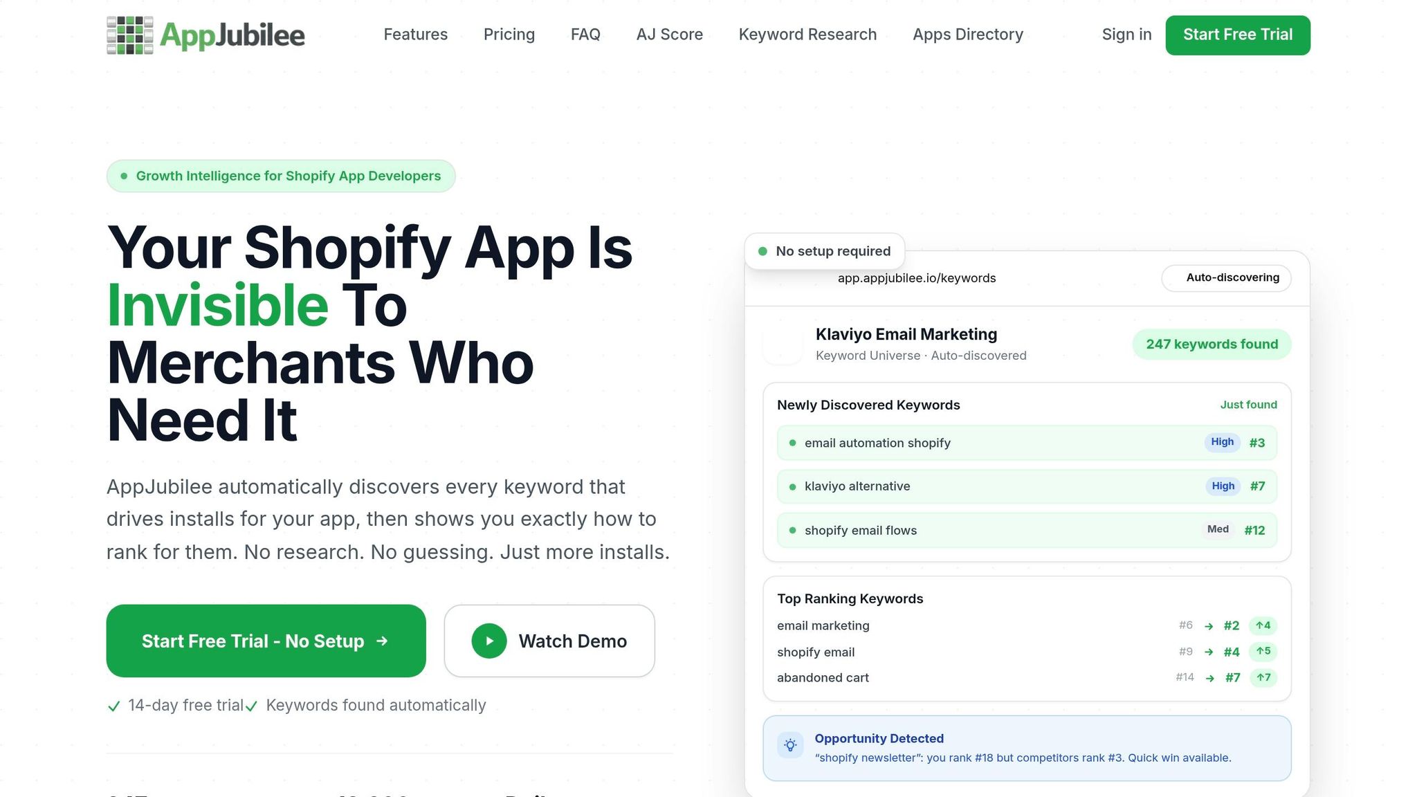
Once your test is set, use AppJubilee to log the change and check the results. Record each image update and connect it straight to ranking and install data.
Listing Change Impact Tracking places every cover image or screenshot update on top of your keyword ranking data. With daily tracking and ranking snapshots, you can compare performance before and after the change and see if the new image set moved rankings in the 7-day and 30-day windows that matter most.
Raw ranking data helps, but it doesn't tell the whole story. Context keeps the read honest. AppJubilee also marks confounders, so you can spot other factors that may have affected the result. Use those confounder flags along with GA4 and Shopify Partners integrations to separate image impact from review spikes, traffic shifts, or install changes, so you don't credit the image for a lift it didn't cause.
For each image update, track both ranking and install changes across the 7-day and 30-day windows.
Then look for patterns. If the same kinds of image changes keep leading to gains, lean into them. If they keep falling flat, that's your cue to test a different angle next.
Conclusion
Once you've worked through the checklist, the next step is pretty plain: keep what helps installs and cut what hurts them. Your Shopify app listing images do one of two things. They either move people closer to installing, or they get in the way.
Think of the gallery as one clear story, not a stack of random screenshots. Image #1 should show the real UI and the main value right away. The next two images should walk through the core workflow and the main payoff. After that, each frame should add one new proof point.
When the gallery tells that story well, check it against ranking and install data. That's how you move from guesswork to proof. Test the set, look at the numbers, and use that data to shape the next round. If you use AppJubilee, log a baseline snapshot before publishing changes so you can compare ranking and install results after the update.
A few rules matter here:
- Test one change at a time
- Let the results decide what stays
- Make sure a merchant can understand the problem, value, and trust signal from the images alone
- Review the listing on mobile
- Check that each image is easy to read and clearly different
- Replace any frame that doesn't add new information
That way, each image has a job to do, and the gallery works like a sales flow instead of filler.
FAQs
How many screenshots should I upload?
Shopify doesn’t give a set number. The main goal is to use clear, polished screenshots that show what your app does, highlight its main features, and make the merchant problem it solves easy to understand.
One thing to watch: changes to your listing images can affect search rankings. That’s why it helps to track results before and after each update. With AppJubilee, you can monitor performance over time and figure out which screenshot count and layout get the best response from your audience.
Should I use PNG or JPEG?
Use PNG or JPEG for your Shopify App Store listing. Both formats are widely supported.
What matters most is image quality. Your screenshots should look polished, feel on-brand, and make your value clear at a glance.
Whatever format you pick, make sure your images are easy to read on mobile and stay consistent with your brand style. After you update your screenshots, use AppJubilee to track the impact on organic search rankings and installs.
How often should I update listing images?
Update your listing images, including screenshots, at least every 30 to 60 days.
This sends a clear signal to merchants and the Shopify algorithm that your app is active and maintained. And that can help support higher rankings.
AppJubilee can help you track how screenshot updates line up with shifts in keyword positions, so you can keep improving based on data instead of guesswork.