CTA Placement: Best Spots for Installs
Optimize CTA placement—above the fold, sticky footers, and thumb-friendly mobile buttons—to boost app installs and conversions.

Want more app installs? Start with your CTA placement. Research shows that users spend 57% of their time above the fold, and 72% of iOS App Store visitors don’t scroll. If your call-to-action (CTA) isn’t visible right away, you’re losing conversions.
Here’s what works:
- Above-the-Fold CTAs: Grab attention immediately with a clear, visible button.
- Sticky CTAs: Keep your CTA accessible as users scroll, boosting clicks by 27%.
- Mobile Optimization: Place CTAs in the thumb-friendly bottom third of the screen.
- Contextual Placement: Align CTAs with high-impact content like pricing tiers or feature highlights.
Small tweaks like contrast adjustments or better button placement can double installs. Ready to fix those missed opportunities? Let’s dive in.
7 Call to Action CTA Best Practices for Guaranteed Landing Page Conversions
Common CTA Placement Problems That Hurt Install Rates
Even the best-designed "Install" button can fail if it’s poorly positioned, overshadowed by other elements, or doesn’t align with user intent. Issues like being off-screen, competing visually with other components, or appearing at the wrong time can all lead to fewer installs.
CTAs That Are Hard to See or Find
Did you know that users spend 57% of their viewing time above the fold? If your CTA is buried further down the page, it’s already at a disadvantage. This is especially critical on the iOS App Store, where 72% of product-page sessions end without any scrolling. If users don’t even see your CTA, they can’t act on it.
But visibility isn’t just about position. CTAs that blend into the background with low-contrast colors or unclear styling can look inactive or unimportant. Users might glance right past them. As Heurilens explains:
"Placement determines whether your CTA gets seen at the moment of highest intent."
To ensure your CTA is visible to everyone, it needs to meet WCAG AA contrast standards of at least 4.5:1. Failing this standard could render your CTA practically invisible to a significant portion of users.
Once visibility is addressed, the next challenge is making sure your CTA doesn’t get lost in a cluttered design.
CTAs That Compete With Other Page Elements
A cluttered page can overwhelm users. When multiple CTAs have the same visual weight, or when the install button is surrounded by busy navigation bars, banners, or dense text, users may not know what action to take. A study by MECLABS showed that removing a distracting navigation bar and repositioning the CTA led to a 220% increase in conversion rates.
The solution isn’t just about removing elements - it’s about creating a clear visual hierarchy. Your primary CTA should be bold and attention-grabbing, while secondary actions should have subtler designs. Heurilens emphasizes this point:
"When everything is a priority, nothing is. Limit to one primary CTA per viewport."
Beyond clutter, another common mistake is failing to align CTA placement with user intent on different pages.
Mismatched CTA Placement Across Page Types
Not all pages serve the same purpose, so your CTA placement should adapt accordingly. For example, on an app listing page, users are still evaluating your app. Pushing an aggressive "Install Now" button before they’ve had a chance to check out screenshots or read the description can create unnecessary friction. On the other hand, on a pricing page, users are likely ready to act - if the CTA is buried or delayed, you risk losing them.
Timing is everything. Consider this: 82% of app trial starts happen on Day 0, the same day the app is installed. If your CTA is hidden deep in the user flow or only appears after multiple steps, you’re missing the peak moment of intent. Each page’s CTA should match the user’s decision-making stage, ensuring high-converting pages perform as they should.
Where to Place CTAs for Maximum Visibility
Getting users to notice and interact with your CTA is all about strategic placement. It’s not just about having the right message - it’s about putting it in the right spot.
Above-the-Fold Placement
Positioning your install button above the fold - where it’s immediately visible without scrolling - is a proven strategy. This approach leverages iOS's default layout and results in a 33.4% median conversion rate, compared to 27.7% on Google Play.
Why does this work? Research reveals that users spend over half their screen time on the visible area they see first. Plus, only 23% of merchants click "read more" on app listings. That means the initial 3–5 lines of your description are incredibly valuable. As Big Moves Marketing explains:
"The first 3-5 sentences are critical as they appear before the 'read more' button. Shopify's click data reveals that only 23% of merchants click 'read more,' highlighting the importance of front-loading key information."
To make the most of this space, pair your above-the-fold CTA with a compelling value proposition. A button alone won’t cut it - users need a clear reason to act right away. For longer pages, though, another tactic can keep your CTA in play.
Sticky CTAs for Long Pages
When your content stretches beyond a single screen, sticky CTAs become essential. These CTAs stay visible as users scroll, ensuring they’re always just a tap away. Sticky CTAs have been shown to boost clicks by 27% and increase mobile conversions by 17% - all without driving up bounce rates.
Take Shop Boss, for example. In April 2026, the SaaS company saw a 305% jump in conversions after adding a sticky CTA to their long-scroll content. This simple adjustment kept their primary action front and center, no matter how far users scrolled.
However, sticky CTAs aren’t for every page. They work best on pages that are longer than two viewport heights. On shorter pages, they can feel cluttered and unnecessary.
Placing CTAs Next to Key Information
Strategic alignment with high-impact content can also make a big difference. Place CTAs near value propositions, feature highlights, or social proof to capture attention when users are most engaged. In fact, CTAs placed alongside key content deliver 121% higher conversions than those stuck at the bottom of the page.
Your first two screenshots are another prime spot for CTAs. As Randy Wattilete, CRO Expert at Kirro.io, emphasizes:
"Your first two screenshots do almost all the work. Order matters more than design."
Adding benefit-driven captions like "Set up in 60 seconds" can turn static visuals into active conversion tools. The takeaway? Place your CTA where users are already focused, not where it’s easiest to fit into the design.
CTA Placement for Mobile vs. Desktop
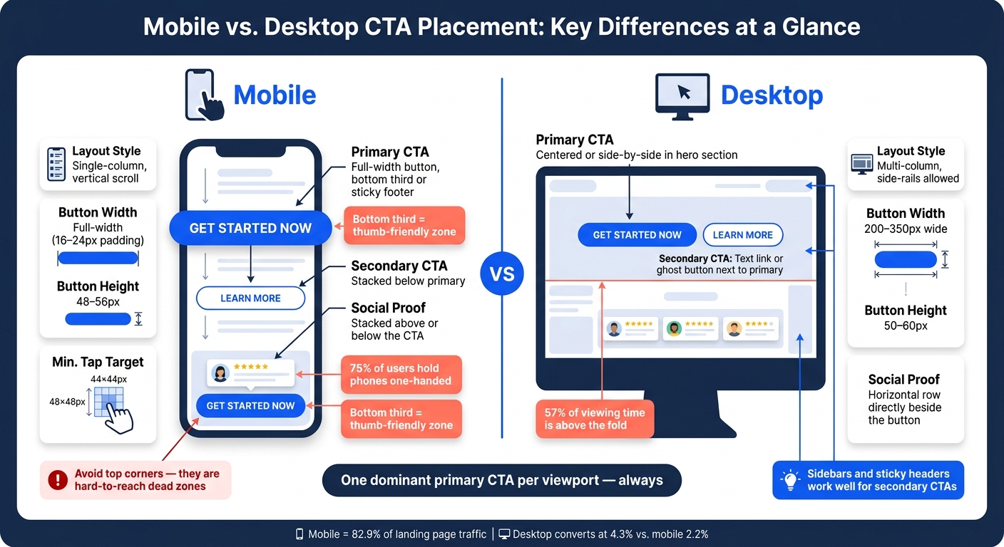
Mobile vs. Desktop CTA Placement: Key Differences at a Glance
When it comes to placing CTAs (calls-to-action), the device being used plays a huge role in determining the best approach. Mobile users interact with touchscreens, primarily using their thumbs, while desktop users rely on cursors. These differences demand tailored strategies to maximize usability and engagement.
Mobile CTA Placement
For mobile, it's all about making things thumb-friendly. Studies reveal that 75% of people hold their phones with one hand, even when they could use both. This means the bottom two-thirds of the screen is prime real estate for your most important CTAs.
"The bottom third of your screen is the most comfortable area for thumb interaction, and it’s where your most important actions should live." - We Are Affective
Avoid placing critical buttons in the top corners - these areas, often called "death zones", are hard to reach with one hand. Instead, opt for full-width buttons that are 48–56px tall with 16–24px horizontal padding. This design improves tap accuracy by 30%. For longer pages, consider using a sticky footer CTA so users can always access it, no matter how far they scroll.
Desktop CTA Placement
Desktops offer more flexibility in design. With wider screens, you can experiment with multi-column layouts, sidebars, and headers - elements that don’t work as well on smaller mobile screens. This extra space also allows you to include trust elements, like review counts or security badges, directly next to your CTA without crowding the design.
Desktop users spend 57% of their time above the fold, making the hero section a critical area for your primary CTA. Secondary CTAs can be placed in sidebars or sticky headers without disrupting the main content flow. For buttons, aim for 200–350px wide and 50–60px tall to ensure they stand out and fit seamlessly into the layout.
| Element | Mobile | Desktop |
|---|---|---|
| Primary CTA | Full-width, bottom third or sticky footer | Centered or side-by-side in hero section |
| Secondary CTA | Stacked below primary | Text link or ghost button next to primary |
| Layout Style | Single-column, vertical scroll | Multi-column, side-rails allowed |
| Button Width | Full-width (16–24px padding) | 200–350px wide |
| Social Proof | Stacked above or below the CTA | Horizontal row directly beside the button |
One extra tip for mobile: make sure any form fields near your CTA use a minimum font size of 16px. This prevents iOS from auto-zooming, which can disrupt the layout right when users are ready to take action.
sbb-itb-ce93587
CTA Placement by Page Type
When it comes to boosting app install conversions, where you place your call-to-action (CTA) is just as important as how it looks. Different pages serve different purposes, and tailoring your CTA placement to match the intent of each page can make a big difference. Let’s break down how to strategically position CTAs on app listing pages, pricing pages, and landing pages.
App Listing Pages
On Shopify app listing pages, users tend to focus on specific elements like ratings, reviews, and feature screenshots. These trust signals play a crucial role in converting casual visitors into committed users. To capitalize on this, position your primary CTA near high-impact elements like your app’s star rating or the "Built for Shopify" badge. These details help reduce hesitation and build confidence in your app’s value.
Keep in mind that users only see the first three lines of your app description before they need to click "more." This means your strongest value proposition should appear right at the top, paired with a subtle push toward action. Additionally, use captions for your screenshots - short, compelling phrases like "See live orders instantly" can act as mini-CTAs, keeping users engaged as they scroll.
"Include a call to action: Tell users what to do next. 'Download free today' or 'Start your 7-day trial' creates a sense of action." - AppDrift
Pricing Pages
Pricing pages require a slightly different strategy. By the time users land here, they’re already interested but may need more clarity before committing. Avoid placing a CTA above the pricing details; users need to understand what they’re getting first. The ideal spot for your primary CTA is directly below each pricing tier, where the value of the plan is clearly outlined.
Adding microcopy under the CTA - like "No credit card required" or "Cancel anytime" - can significantly ease doubts. For example, one case study showed that this simple addition boosted conversions by 124%, jumping from 9.5% to 21.3%. If your page features multiple pricing plans, keep the focus clear by using one prominent CTA per tier. Secondary options can be de-emphasized with ghost buttons or text links to avoid overwhelming users. Too many CTAs can lead to decision fatigue, which has been shown to drop conversions from 13.5% to 10.5%.
Landing Pages
Landing pages offer the most flexibility for CTA placement, but that also means there’s more room for missteps. For users ready to act quickly, an above-the-fold CTA in the hero section is essential. Since 57% of viewing time is spent in this area, make sure your headline, subheadline, and CTA button are immediately visible without scrolling.
For users who need more persuasion, repeat your CTA at strategic points throughout the page, such as after testimonials or detailed feature explanations. Storylane, for instance, saw a 30% increase in demo requests by consistently placing CTAs across multiple scroll points.
The wording of your CTA also matters. Using first-person phrasing like "Start my free trial" instead of second-person ("your") has been shown to perform 90% better. Even small tweaks can have a big impact - switching "Sign up" to "Start my free trial" increased click-through rates by 104%.
Pre-Launch CTA Placement Checks
Before your Shopify app page goes live, a quick review can help identify placement issues that might quietly hurt your install rates. Once you've decided on the best spots for your CTAs, these checks will ensure your design functions as intended. They only take about 30 minutes but can have a noticeable impact on conversions.
Spacing and Contrast
Your CTA button should immediately grab attention. The easiest way to achieve this is by using high-contrast colors that don’t appear elsewhere on the page. If your button blends into the background or competes visually with nearby text, users may not even realize it’s clickable.
Whitespace is equally important. A CTA crammed into dense content loses its visual weight. Make sure your button dimensions align with recommended sizes (desktop: 200–350px wide; mobile: full-width). A quick trick to test this is the squint test - if the CTA isn’t the most noticeable element when you squint, either the contrast or spacing needs adjustment.
Once the visual prominence is sorted, it’s time to evaluate how users interact with the page as they scroll.
Scroll Behavior and Accessibility
If users don’t see your CTA, they won’t click it. Tools like Microsoft Clarity (free) or Hotjar can provide scrollmaps to show how far users typically scroll on your page. If more than 40% of visitors drop off before reaching your CTA, it’s time to move it higher - or make it sticky.
For longer pages, consider a sticky header or footer CTA to keep the action visible at all times. Sticky CTAs can make a big difference in conversion rates. Also, watch for "rage clicks" - repeated, frustrated taps near the button - which often indicate the tap target is too small. Apple suggests a minimum size of 44×44px, while Google’s Material Design recommends 48×48px for touch targets.
Finally, ensure your CTA performs well across all devices.
Consistency Across Devices
With mobile making up 82.9% of landing page traffic but converting at just 2.2% compared to 4.3% on desktop, it’s clear that poor mobile CTA placement is a common issue. A design that looks great on a desktop monitor can easily fall apart on a phone.
Test your page at a 375px width (roughly the size of an iPhone SE screen) to confirm that the CTA is visible above the fold without requiring a swipe. On mobile, buttons should stack vertically rather than sit side-by-side. The primary CTA should also be positioned within the natural thumb zone - either centered or near the bottom of the screen.
Double-check these device-specific guidelines before launch:
| Element | Desktop | Mobile |
|---|---|---|
| Button Width | 200–350px | Full-width, 16–24px padding |
| Button Height | 50–60px | 48–56px |
| Min. Tap Target | - | 44×44px to 48×48px |
| Placement | Above the fold / mid-right | Sticky footer / centered |
Stick to one dominant primary CTA per viewport. Secondary actions should appear as ghost buttons or text links. Pages with a single, repeated CTA (placed in the hero section, mid-page, and footer) tend to perform 20% to 30% better than pages with competing CTAs.
Conclusion: Key Points on CTA Placement for More Installs
Getting your CTA placement right takes constant testing, tracking, and fine-tuning. The goal? Position your CTA where user intent is at its peak. This could mean placing it above the fold on a high-intent landing page, mid-page after explaining your value, or using a sticky footer for mobile users.
The most common pitfalls - like burying CTAs in cluttered layouts, asking for big commitments before building trust, or ignoring how buttons behave on smaller screens - are often easy to correct once you know what to focus on. Even small changes can lead to big results, sometimes even doubling installs. By testing systematically, you can keep improving your install rates.
Start by tweaking your copy for maximum impact, then work on placement, design, and microcopy details like "No credit card required". Keep in mind, only 1 in 7 A/B tests delivers statistically significant results, but when they do, the average improvement is 49%.
"A call-to-action isn't decoration. It's where intent becomes measurable action." - FunnelSense
If you're managing a Shopify app listing, tools like AppJubilee (https://appjubilee.io) can help you monitor how changes - like updates to your CTA - affect your rankings and installs over time. Use these strategies to turn every CTA into a powerful conversion point.
FAQs
How do I know if my CTA is actually above the fold on mobile?
To make sure your call-to-action (CTA) is visible without scrolling on mobile, it needs to appear within the device's viewport. Ideally, it should sit in the bottom two-thirds of the screen, where it's easy to reach for most users.
You can use device simulation tools or test on different mobile devices to confirm its placement. For an even better approach, consider using sticky or floating CTAs. These ensure your button stays accessible, effectively keeping it "above the fold" even as users scroll.
When should I use a sticky CTA versus repeating CTAs on the page?
Keeping your call-to-action (CTA) in plain sight is a smart move, especially on long pages or mobile screens. A sticky CTA stays visible as users scroll, making it easier for them to take action without having to hunt for the button. This simple tweak reduces friction and keeps the focus on your goal.
On longer pages, it’s also effective to place CTAs at key points - the top, middle, and bottom. This way, you remind users of the action you want them to take without bombarding them.
Both strategies - sticky CTAs and strategically placed CTAs - should be tested to see what works best for your audience. Adjust them based on the page length and overall user experience to get the best results.
What’s the fastest way to test CTA placement changes without hurting installs?
The quickest way to see if changing your CTA (Call-to-Action) placement works better? Run an A/B test. Here's how:
- Create two versions of your page: one with the original CTA placement and another with the new one.
- Split your traffic evenly between the two versions (e.g., 50/50).
- Track key metrics, such as clicks or other relevant actions.
Make sure to let the test run for at least two weeks or until you reach statistical significance. This ensures your results are reliable and helps you avoid any unintentional impact on installs.