
App Description Examples From Top Shopify Apps
Examples and patterns from top Shopify apps: lead with merchant outcomes, use category keywords early, and format copy for fast scanning.
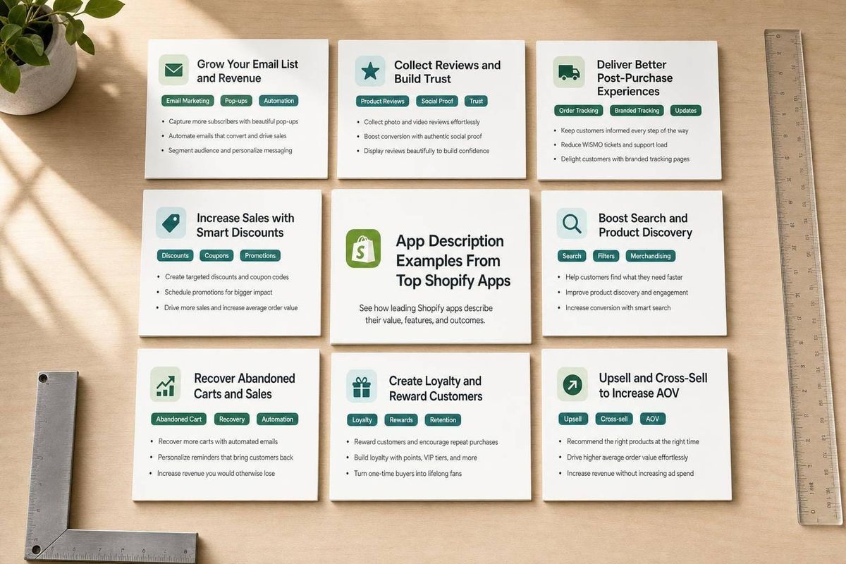
Most top Shopify app listings do the same few things well: they lead with the result, place category terms near the top, explain features in plain English, and format the page for fast scanning. In a store with 17,891 active apps as of August 18, 2026, that structure can help merchants judge fit in seconds.
If I boiled this article down, I’d say this:
- Start with the merchant outcome, not the feature list
- Use category search terms early like email marketing, product reviews, subscriptions, loyalty, and page builder
- Tie each feature to a job and result
- Keep the layout easy to skim with short sections and bullets
- Track edits against ranking and install data instead of guessing
The article breaks this down through six apps:
- Klaviyo - email, SMS, and WhatsApp growth
- Judge.me - reviews, trust, and conversion
- Loox - photo reviews, UGC, and social proof
- Bold Subscriptions - recurring orders and repeat revenue
- Yotpo - reviews plus loyalty and retention
- PageFly - no-code page building tied to conversion
What stood out to me most: none of these listings opens with a dry feature dump. They open with what the merchant gets.
Quick Comparison
| App | Main focus | Opening angle | Main copy pattern |
|---|---|---|---|
| Klaviyo | Email & SMS marketing | More sales through automation | Outcome first, then use cases |
| Judge.me | Product reviews | Trust and conversions | Features grouped by merchant job |
| Loox | Reviews & UGC | Visual proof that sells | Social proof language and storefront results |
| Bold Subscriptions | Subscriptions | Recurring revenue | Problem → workflow → repeat sales |
| Yotpo | Reviews & loyalty | Trust plus retention | Reviews first, loyalty second |
| PageFly | Landing page builder | Build pages that convert | No-code workflow tied to performance |
In short, this article is a practical guide to how top Shopify apps write listing copy that is easier to find, easier to skim, and easier to act on.
sbb-itb-ce93587
What Strong Shopify App Descriptions Have in Common
These six apps point to five patterns you can use again and again. They make descriptions easier to skim, easier to trust, and easier to act on.
Lead with the main merchant outcome
Start with the result merchants care about most: more reviews, better repeat purchase rates, or faster publishing.
The first lines should answer one simple question: What result does this app deliver? The best app descriptions don’t dance around that. They put the payoff front and center.
Use category keywords in natural language
Words like email marketing, product reviews, subscriptions, loyalty, and landing page builder should show up early.
But there’s a catch. Don’t dump them into a keyword stack. Work them into normal sentences so the copy reads like it was written for people, not just search.
Explain features in plain terms
Turn features into clear merchant actions and outcomes.
Say “set up subscription billing in minutes” instead of “configurable recurring billing infrastructure.” That plainspoken style shows up again and again in the app examples below, and it works because merchants can see what they’ll do with the app right away.
Keep claims specific and credible
Loose claims like “world-class solution” or “guaranteed to grow your revenue” don’t build trust. They do the opposite.
Specific claims carry more weight:
- Install counts
- Star ratings
- Realistic outcome ranges
- Honest qualifiers like “best suited for subscription brands”
That kind of detail feels grounded. It gives merchants something they can judge.
Format for scanning
Most merchants are skimming. They’re comparing a few apps at once, not reading every line.
That’s why formatting matters. Short paragraphs, bullets, and clear subheads help people check fit in seconds. Put the main benefit, the category term, and the key differentiator near the top. Then use short paragraphs and bullets for the rest.
1. Klaviyo Email & SMS Marketing
Klaviyo is a clean example of this framework at work. It starts with an outcome-led promise: build email marketing, SMS, and WhatsApp campaigns with AI to grow ecommerce sales.
The keyword use is intentional. Email Marketing & SMS appears right in the app title, so two core search terms show up at once. As of August 18, 2026, Klaviyo ranks #1 for "email marketing", "SMS marketing", "email capture", and "welcome email" in the Shopify App Store. And the copy doesn’t force those phrases in awkwardly. It weaves them into the language around campaigns, segmentation, and automation.
What helps the description land is the level of detail. It mentions Shopify data syncing in milliseconds, which tells merchants that messages and insights reflect live store behavior. It also calls out 350+ integrations, giving teams a clear way to gauge technical fit before they dig deeper.
The structure does a lot of work too. The copy starts with channel-level outcomes - email, SMS, and WhatsApp campaigns - then shifts into platform capabilities like unified customer data, AI-driven segmentation, and automated workflows. It also names familiar use cases, including welcome series, abandoned cart, and post-purchase follow-ups, instead of hiding behind generic automation talk. That makes the listing easy to scan and easy to connect to day-to-day ecommerce work.
2. Judge.me Product Reviews App
Like Klaviyo, Judge.me leads with outcomes. But here the promise leans more on trust. It starts with a clear value prop: it helps merchants collect and display reviews to build trust and increase conversions. That works because it says what the app does and ties it straight to business results.
The app title includes "product reviews," and the description backs that up with related phrases like review requests, photo reviews, and star ratings in plain, conversational language. That keeps the listing aligned with review-focused search intent.
The feature set also stays tied to merchant value. Review syndication helps extend reach beyond the storefront, Q&A and voting tools support engagement, and review migration lowers the friction of switching from another tool.
Another smart move: the features are grouped by job to be done for the merchant - collection, display, engagement, and syndication - instead of being dumped into one flat list. That makes the listing easier to scan fast.
3. Loox Product Reviews & UGC
Where Judge.me leans on written reviews, Loox goes hard on visual proof. Right away, Loox leads with the outcome for the merchant, not the setup process. It talks in plain English about building trust and increasing conversions, which makes the pitch easy to grasp fast.
Near the top, the description brings in category terms like product reviews, photo reviews, and social proof and UGC. That lines up with high-intent review searches people are already making. Add in photo and video reviews, plus UGC syndication, and the message stays fixed on customer content that helps shoppers feel less unsure before they buy.
Loox also uses annotated screenshots that show the result inside a storefront instead of only showing the settings screen. That matters. It helps merchants picture what buyers will see before they install the app.
You can see the same plainspoken approach in the next example, but aimed at a different merchant goal.
4. Bold Subscriptions
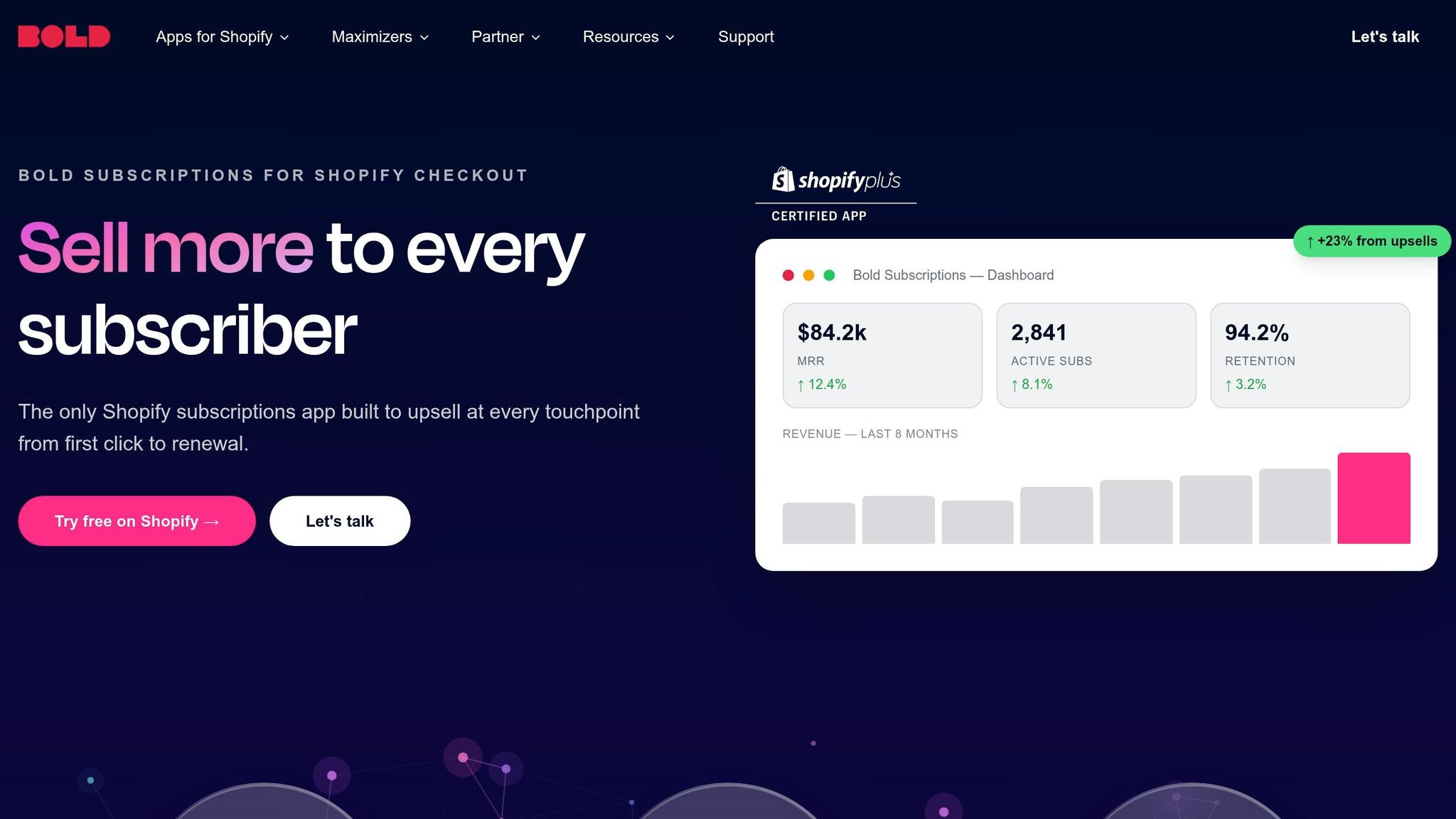
Where Loox sells trust through reviews, Bold makes a straight business pitch: turn one-time orders into recurring revenue.
That angle lines up with what merchants want. They're not just looking for another app. They're trying to build a store with steadier income.
Bold also puts high-intent terms like subscriptions and recurring orders near the top of the listing, which matches the way merchants search. And those terms don't sit in the title alone. They show up in the copy too, so the listing stays in sync with how merchants describe the problem they're trying to solve.
The flow is simple and effective. It starts with the merchant's problem, then connects billing automation and a customer portal to retention, analytics, and repeat sales. In plain English, that means fewer manual renewals, easier subscription management, and a cleaner path to retained revenue.
5. Yotpo Product Reviews & Loyalty
Yotpo leads with reviews to build trust and increase conversions, then expands into loyalty to help with retention and CLTV. The title puts Product Reviews first, so the main category is clear right away.
The feature copy stays focused on outcomes instead of getting too technical. Each capability is tied to the problem it solves for merchants, which keeps the listing easy to read and makes each feature feel connected to a business result. Loyalty shows up as an extension of the main reviews pitch, not as a separate message. That helps the listing stay clear even though it speaks to more than one merchant goal.
That same outcome-first structure shows up again in the next app, but aimed at a different merchant goal.
6. PageFly Landing Page Builder
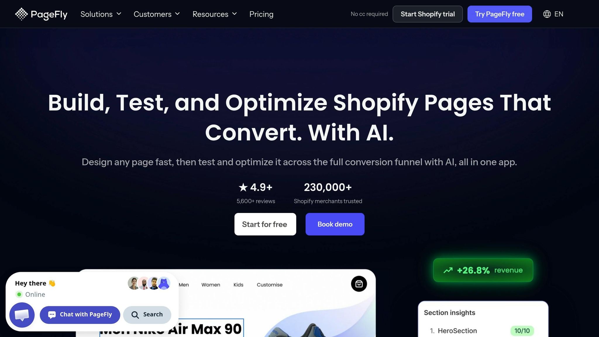
PageFly leads with the outcome first: an AI-powered page builder that helps merchants build high-converting landing and product pages and improve conversion rate optimization. Just like the other examples, it starts with the business win, not a long feature dump.
It also puts key category terms near the top, including landing page builder, product pages, store pages, and page builder. That helps the description stay clear while still sounding natural.
The core promise is simple: build pages for conversion without code. PageFly supports that claim with templates, integrations, A/B testing, and SEO controls.
The feature copy stays focused on action. It uses plain language merchants can scan fast, with phrases around drag-and-drop editing, starting from templates, and adding conversion elements like countdown timers and trust badges. That matters when someone is comparing Shopify app store optimization tools side by side and wants to get the point fast.
What makes PageFly stand out is that it doesn't frame itself as just a design tool. It ties page building to performance. Words like lightning-fast, SEO-optimized, and conversion-focused show up next to design features, which signals that the app is built to support traffic, search visibility, and sales. In a small space, PageFly ties together design, speed, SEO, and conversion into one clear value story.
Next, compare these patterns side by side to see how the strongest descriptions open, format features, and signal value.
How To Compare These Description Patterns Side by Side
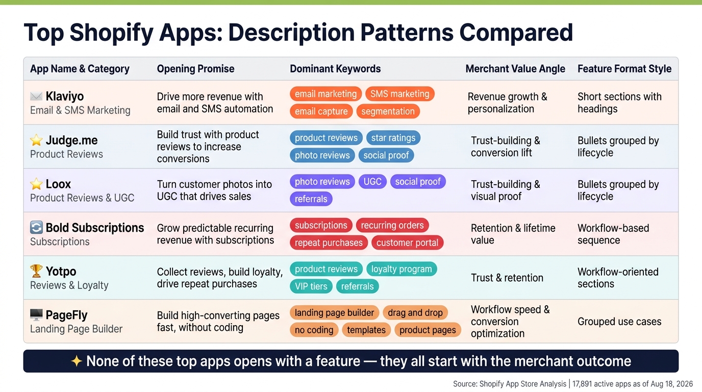
Top Shopify Apps: Description Patterns Compared
Once you’ve reviewed each app on its own, put them next to each other and compare three things: promise, keyword use, and feature format. That side-by-side view makes the main listing patterns much easier to spot.
Compare opening promise, keywords, and value angle
Each app opens with a different merchant outcome. The table below pulls those differences into one place.
| App | Primary App Category | Opening Promise | Dominant Keyword Cluster | Merchant Value Angle | Feature Formatting Style |
|---|---|---|---|---|---|
| Klaviyo | Email & SMS marketing | Drive more revenue with email and SMS automation | email marketing, SMS marketing, email capture, segmentation | Revenue growth, personalization | Short sections with headings |
| Judge.me | Product reviews | Build trust with product reviews to increase conversions | product reviews, star ratings, photo reviews, social proof | Trust-building, conversion lift | Bullets grouped by lifecycle |
| Loox | Product reviews & UGC | Turn customer photos into UGC that drives sales | photo reviews, UGC, social proof, referrals | Trust-building, visual proof | Bullets grouped by lifecycle |
| Bold Subscriptions | Subscriptions | Grow predictable recurring revenue with subscriptions | subscriptions, recurring orders, repeat purchases, customer portal | Retention, lifetime value | Workflow-based sequence |
| Yotpo | Reviews & loyalty | Collect reviews, build loyalty, drive repeat purchases | product reviews, loyalty program, VIP tiers, referrals | Trust and retention | Workflow-oriented sections |
| PageFly | Landing page builder | Build high-converting pages fast, without coding | landing page builder, drag and drop, no coding, templates, product pages | Workflow speed, conversion optimization | Grouped use cases |
One thing stands out fast: none of these top apps opens with a feature. They all start with the merchant outcome.
Compare feature formatting styles
Format matters just as much as the features themselves. Review apps lean on short, lifecycle-based bullets. Klaviyo and PageFly use short sections with headings. Bold Subscriptions and Yotpo move through a workflow-style sequence, which helps merchants picture both setup and day-to-day use.
Look for repeated copy patterns by category
The same copy patterns show up again and again across these six apps. Review apps tie social proof to conversion gains. Subscription apps focus on recurring orders and predictable revenue. Loyalty-led copy brings in VIP tiers and repeat customers. Page builders connect design terms to performance language like conversion and speed.
That’s not accidental. These patterns line up with what merchants in each category search for and what they want to know before they install. The strongest listings work category terms into the copy in a natural way, while keyword stuffing makes the description harder to read and less useful.
Use these patterns as your baseline before you track copy changes.
Using AppJubilee To Measure Description Changes
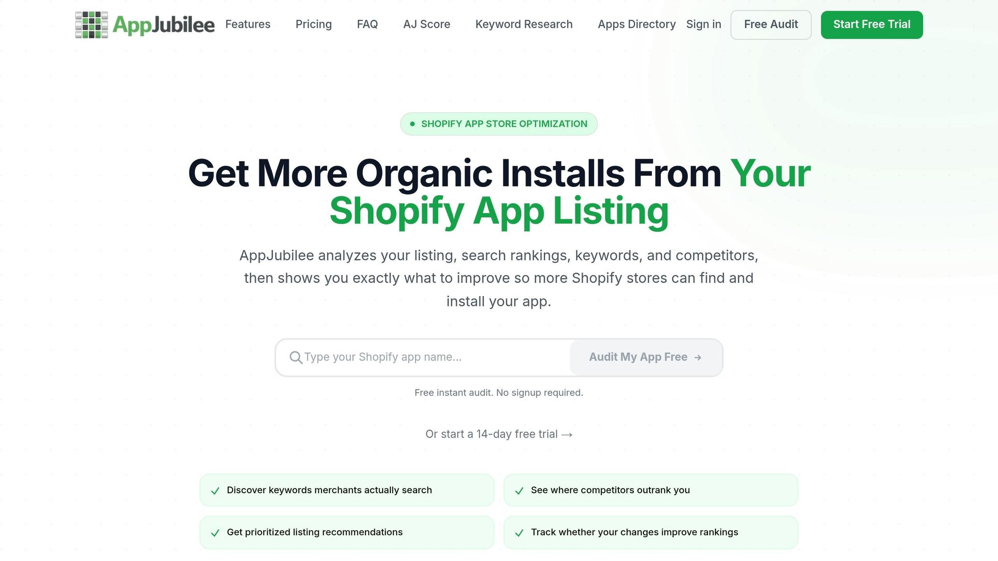
AppJubilee tracks daily keyword rankings across 1,200+ Shopify App Store keywords and 18,600+ apps, which gives you a clear way to see if description edits help your listing show up more often. Instead of making changes and hoping for the best, you can test them against actual ranking data.
Track keyword movement after copy edits
Each time you update your app description, AppJubilee logs the change and shows before-and-after ranking data over time. That means you can look at a specific edit and see whether visibility moved up, stayed flat, or slipped. AppJubilee's founder says the tool was built to track Shopify App Store search more directly.
Compare listing changes against competitors
After you know which terms matter most, you can stack your listing up against apps chasing those same rankings. AppJubilee maps competitors by keyword overlap and alerts you when their rankings or listing copy changes. That includes shifts in opening language, keyword placement, and feature framing.
This is where things get practical. If a competitor starts moving up after changing how they describe setup, pricing, or outcomes, you have a clue worth checking.
Use review signals to refine messaging
Keyword data tells you what merchants type into search. Review data, including research on fake reviews, tells you how they talk about the problem in plain English.
AppJubilee's review intelligence pulls merchant phrases from reviews, like "easy to set up" or "increased average order value," so you can check whether your description uses the same clear, trusted language merchants already use. You can then tie those wording changes back to installs and activation.
That makes the takeaways below a lot easier to put into practice.
Key Takeaways From Top Shopify App Descriptions
The best Shopify app descriptions tend to follow the same four habits: lead with the outcome, use category terms early, explain features in plain language, and make the page easy to scan.
Use this checklist when you rewrite a listing. These are the exact copy moves shown across the six app examples above, not broad copy tips.
Start with the result merchants want
Skip the warm-up. Your first line should name the merchant’s problem and the result they want right away.
Put important category terms near the top
Early keyword placement can help Shopify understand your app. For example, if you're optimizing for json ld for seo, ensure that specific phrase appears in your first two paragraphs. It also helps a merchant scanning the page see, fast, that they’re in the right place. Use those terms in natural sentences, not in awkward keyword stacks.
Tie features to workflows and outcomes
Don’t just name a feature. Show what the merchant does with it and what happens next.
For example, instead of listing a tool by itself, connect it to the job:
- what the merchant can do
- how that fits into their workflow
- what result it leads to
Keep the layout easy to scan
Use short sections, grouped bullets, and plain headers. When listings follow a clean structure like this, they’re also easier to test side by side.
Conclusion
A strong Shopify app description needs to do three jobs at the same time: help merchants find your app, explain what it does in plain English, and give people a solid reason to install it.
That pattern shows up in all six examples in this article - Klaviyo, Judge.me, Loox, Bold Subscriptions, Yotpo, and PageFly - even though each app serves a different type of need. Use those examples as a simple check before you publish, then test what happens.
Once your copy is clear, look at performance. After each revision, track your views-to-installs rate and keep adjusting if that number stays weak.
If you want a faster way to spot impact, use AppJubilee. It can track keyword movement and show whether your edits changed visibility. Think of each update as a test of your opening promise, keyword placement, and how you frame features.
Work through one listing at a time. Pick one of the six apps above as your benchmark, rewrite your opening around the merchant outcome, tighten the feature section, and then monitor keyword rankings, views, installs, and review feedback for 30 to 60 days. After that, run the same cycle again on the next live listing.
FAQs
How long should a Shopify app description be?
The App Details section gives you room to work, so focus on quality, not length.
Keep the intro to about 100 characters. That forces you to get to the point fast and speak to the merchant’s problem right away.
Don’t chase a set word count. Use action-focused language instead, and keep keyword density around 3% to 4% so the copy doesn’t trip spam filters.
It also helps to update your description every 30 to 60 days so it doesn’t feel stale.
Which keywords should I place near the top of my listing?
Prioritize high-intent, long-tail keywords that spell out your app’s main features or the problems it solves for merchants. Put your primary keyword in the first few sentences so people understand your value right away.
It also helps to include core keywords that 40% or more of competitors use in your title, description, and listing copy. That can help you hold onto visibility.
How can I tell if a description rewrite improved installs?
Track performance after the rewrite across 3-, 7-, and 14-day windows. Keyword updates often need 2 to 4 weeks before they show up in rankings and install volume, so early checks help, but they don't tell the whole story.
With AppJubilee, you can compare before-and-after listing data, target keyword movement, organic installs, and your AJ Score. That gives you a clear read on what happened and helps you decide whether to reuse the new copy, keep testing, or roll the changes back.