
Optimize App Listing Screenshots for More Installs
Screenshots should tell a simple story—problem → fix → result—and the first image must prove the app in three seconds.
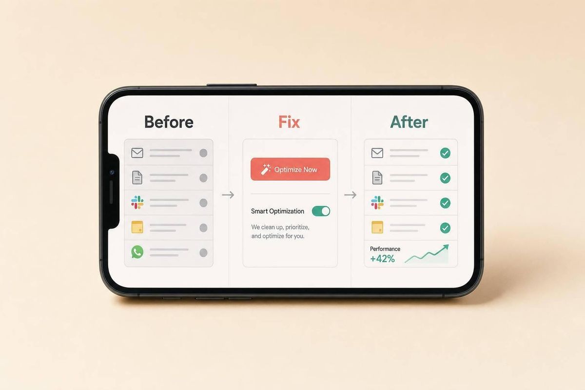
Your screenshots can decide whether a merchant installs your app in seconds. If I want more installs, I need to make the first image explain the problem, show the fix, and hint at the result - fast.
Here’s the short version:
- Plan screenshots around one pain point and one type of merchant
- Make the first screenshot carry the main promise
- Use a simple story flow: problem → fix → result → proof
- Write short overlays that say what the merchant gets, not just what the app does
- Test one change at a time and watch view-to-install rate for 7–14 days using a dedicated platform to win more installs on the Shopify App Store
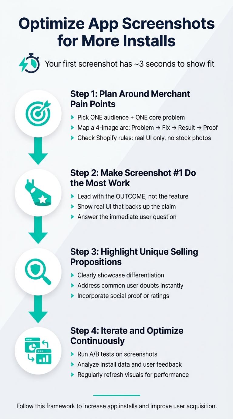
A few points matter most. Merchants often scan instead of read. That means my first screenshot has about 3 seconds to show fit. And if I change the hero image, overlay copy, and screenshot order at the same time, I won’t know what moved installs.
The goal is simple: make the install choice feel easy. I should show one outcome, back it up with real UI, keep the gallery clean, and judge results by installs - not views alone, or compare Shopify app optimization tools to see how different platforms track these metrics.
If I do that, my screenshots stop being decoration and start doing sales work.
App Store Screenshot Optimization: 4-Step Framework for More Installs
How to Create App Store Screenshots That Get More Downloads
sbb-itb-ce93587
Step 1: Plan screenshots around merchant pain points and install goals
Strategy comes before design. Once you know the main pain point, turn it into a screenshot plan before you touch a design tool. Start with one clear question: what exact problem does this app solve, and who is it for? The goal is simple: make the merchant feel confident enough to install. Without that anchor, screenshots can turn into a random gallery instead of something that drives installs.
Pick one core use case and one primary audience
Choose one audience, one problem, and one install outcome before you design anything. Merchants search by problem, not by feature, using terms like product review to find solutions. They look for terms like "stop overselling", not feature-packed phrases like "advanced rules engine". Your screenshots need to match that way of thinking.
Focus on one job-to-be-done: one main audience and one clear outcome, like stopping oversells that lead to refunds and angry customers. Specific metrics make the message hit harder. Phrases like "saving hours per week" or "increasing repeat orders" tend to work better than vague claims.
Map pain points to a screenshot sequence
Once the core problem is clear, turn it into a simple four-image arc: problem → fix → result → proof. That gives your screenshots a story instead of a pile of screens.
For example, don't lead with a settings panel. A stronger screenshot might open with a dashboard labeled "Recovered Revenue" because it shows the money outcome the merchant cares about. After the story is mapped out, make sure the images still follow Shopify's screenshot rules.
Check Shopify listing rules before you design
Shopify requires real app UI only. That means no stock photos, abstract graphics, logo-only frames, cluttered backgrounds, or customer data.
So your screenshot plan can't be a one-and-done exercise. Build it with room to test, tweak, and tighten from the start.
Step 2: Make the first screenshot do the most work
Once the pain point and flow are set, ask one thing: what should the first screenshot prove? That image needs to carry the biggest promise and answer "Should I install this?" before a merchant reads a single word. Then make the screenshot prove it.
Lead with one clear outcome, not a feature list
The biggest mistake in the first screenshot is simple: teams lead with what the app does instead of what the merchant gets. A settings panel or a feature checklist doesn't say much at a glance.
Use the first screenshot to show the outcome. Lead with one result, like recovered revenue or time saved. Say it in plain merchant language. Keep the frame clean so the message lands fast.
Show real UI that backs up the claim
The headline makes the promise. The UI proves it.
Once the outcome is clear, the UI needs to confirm it. If speed matters, show a before-and-after result. If it changes what a customer sees, show the storefront result. If it lives in the Shopify admin, show the dashboard or workflow that proves the benefit. Use one label or arrow to point to the payoff. That first proof sets the tone for the rest of the gallery.
Step 3: Build a screenshot flow and write short text overlays
Once the first screenshot proves the promise, the next images should explain it and back it up. The screenshot order tells the story. The overlay text makes each frame easy to understand in a split second.
Order screenshots by problem, solution, result, and proof
Treat the first three screenshots like a mini pitch: outcome, how it works, proof.
After that, use the rest of the gallery for supporting details. This is where you can show integrations, key settings, edge cases, or social proof. Just don’t repeat the main message in slightly different words.
Write overlays that are short, specific, and easy to scan
Each overlay headline should do ONE thing: show the merchant what they’re seeing and why it matters.
Keep it short. Say things like "No more manual entry" or "Recovered revenue, automatically" instead of "Advanced automation rules engine." The first version is clear. The second sounds like internal product jargon.
Use plain merchant language. If your app tracks inventory, write "Low stock alerts before you oversell" - not "Inventory sync rules engine." Specific wording lands better because it connects to the problem the merchant already feels.
Numbers can help too, but only when they’re accurate and easy to back up. A soft, fuzzy stat does more harm than no stat at all.
Pick an overlay style that fits your app's message
After the sequence is set, use overlays to make each screenshot easy to scan. These three overlay styles tend to work well. Pick the one that gets your app’s install value across the fastest.
| Overlay Style | What It Focuses On | Best-Fit Use Case | Clarity |
|---|---|---|---|
| Metric-led | Concrete numbers and data (e.g., "+24% Conversion") | Apps with measurable ROI like SEO or cart recovery analytics | High; gives instant proof |
| Outcome-led | The final result or relief from a pain point | Apps solving immediate problems (e.g., "Stop overselling") | High; tells the merchant right away why it matters |
| Feature-plus-benefit | What it does and why it helps | More complex workflows (e.g., "Real-time sync to prevent refunds") | Moderate; takes a bit more scanning but explains the how |
Whatever style you pick, keep it consistent across the whole gallery. Use the same font, color treatment, and tone from start to finish. That makes the gallery easier to scan and gives the listing a more deliberate feel, which helps build trust fast.
It also makes later performance tests easier to read, since you’re changing the message itself - not the whole visual system.
Step 4: Test changes and measure whether screenshots lift installs
Treat screenshots like an ongoing test, not a one-and-done design job. After your gallery goes live, the next step is simple: check whether the new screenshot story leads to more installs.
Test one variable at a time
A common mistake is changing the hero image, gallery order, and text overlays all at once. If installs move after that, you can't tell what did the work.
A better approach is to isolate one change per test. That could be:
- the first screenshot's headline
- the order of the gallery
- one overlay style
One change at a time gives you one clear answer. That's how you figure out which screenshot update changes install intent.
Track listing impact with install and visibility data
Before making any edits, record your current view-to-install rate in the Shopify Partner Dashboard and Google Analytics 4.
Then give the test time to breathe. Wait 7–14 days before judging the result, and watch the view-to-install rate closely. If views go up but installs stay flat, the screenshots may be pulling attention without pushing people to act.
"Focus on trends over 7-14 days rather than single-day movements for the most reliable signal." - AppJubilee FAQ
AppJubilee's Change Impact Tracking lets you log update dates, track ranking and install shifts, compare listing change detection tools, and spot other changes that may be shaping the results. That makes it easier to separate the screenshot edit from everything else happening around the listing.
Start with baseline data. Test one change. Wait 7–14 days. Then judge the result by installs, not views alone. Keep the version that wins, cut what doesn't, and move to the next test.
FAQs
How many screenshots should my app listing include?
There’s no set number of screenshots for a Shopify app listing.
What matters is the flow.
Each screenshot should move the story forward and help merchants grasp your value fast. That means every image should show a different feature, screen, or use case instead of repeating the same idea with small changes.
A good way to think about it: each frame should answer a different merchant question. One might show what the app does. Another might show how it works. Another might show the result.
And no matter how many screenshots you include, the first screenshot does most of the heavy lifting. It should show the main interface or end result clearly enough that someone can understand it in about three seconds.
What should I do if my screenshots get more views but not more installs?
This usually points to a gap between what your listing promises and what users see when they click through. Your screenshots should match your current UI and the results people can expect. If the visuals are old, vague, or too abstract, trust can drop fast.
Check GA4 engagement and scroll depth to see where people lose interest. If install conversion drops while rankings stay flat, merchants may be weighing your app against other options.
A few fixes can help:
- Match your messaging to clear pain points
- Show the main workflow in a simple, direct way
- Make sure screenshots reflect the current product
You can also use AppJubilee to track listing changes against installs and rankings.
When should I test a new first screenshot versus changing the screenshot order?
Test a new first screenshot when you need to improve click-through rate. That image does the heavy lifting. It shapes how people see your app’s value, what they can do with it, and the kind of result they should expect. Because of that, it should be your main test variable.
Later, you can change the screenshot order to fine-tune the feature flow: promise, UI, outcome, workflow, and proof. But do that after you’ve tuned the opening hook. Then watch performance over a 14-day window before you decide whether the change worked.