
7 Screenshot Tips for Shopify App Listings
Make Shopify app screenshots mobile-ready: lead with outcome, show one feature per image, add real UI proof, and test to boost installs.
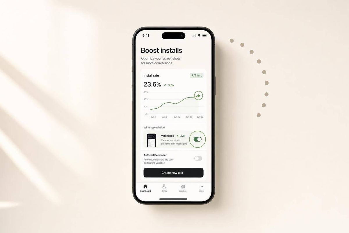
Most Shopify app screenshots fail in the first few seconds. If I want more clicks and installs, I need screenshots that show the result fast, follow a simple order, stay readable on mobile, and use actual app screens.
Here’s the full idea in plain English:
- Lead with the outcome in screenshot #1
- Arrange screenshots like a simple story: result → setup → action → proof
- Keep overlay text short: about 3–7 words
- Show one main feature per image
- Design for phone-sized previews, not just desktop
- Use app screens with proof inside the UI
- Keep the gallery style the same and test changes with data
This matters because the Shopify App Store is crowded, with 17,891 active apps and an average rating of 4.70 stars. When many apps look similar, screenshots often decide who gets the click. The article’s main point is simple: clear screenshots can improve product page views by 15% to 30%, and even small first-image changes can lift installs.
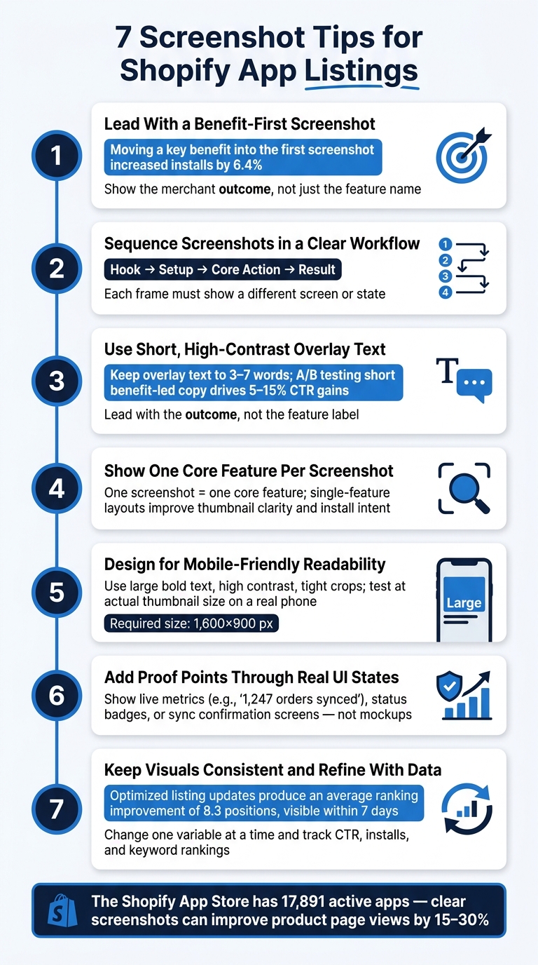
7 Screenshot Tips for Shopify App Listings That Drive More Installs
Screenshot Tips Proven to Convert: Live Product Page Teardown
Quick comparison
| Tip | What I focus on | Why it helps |
|---|---|---|
| 1. First screenshot | Show the merchant outcome | Makes value clear fast |
| 2. Screenshot order | Follow a step-by-step flow | Cuts confusion |
| 3. Overlay text | Use short, bold copy | Easier to read in thumbnails |
| 4. One feature per image | Keep each frame focused | Makes scanning easier |
| 5. Mobile readability | Use large text and tight crops | Works better on phones |
| 6. Proof in the UI | Show live states, stats, or status | Builds confidence |
| 7. Consistent design + testing | Keep one style and measure results | Helps improve CTR and installs |
If I had to boil the article down to one line, it would be this: show what the app does, why it helps, and proof that it works - all in a few fast, easy-to-read screenshots.
Why Screenshot Strategy Matters on the Shopify App Store
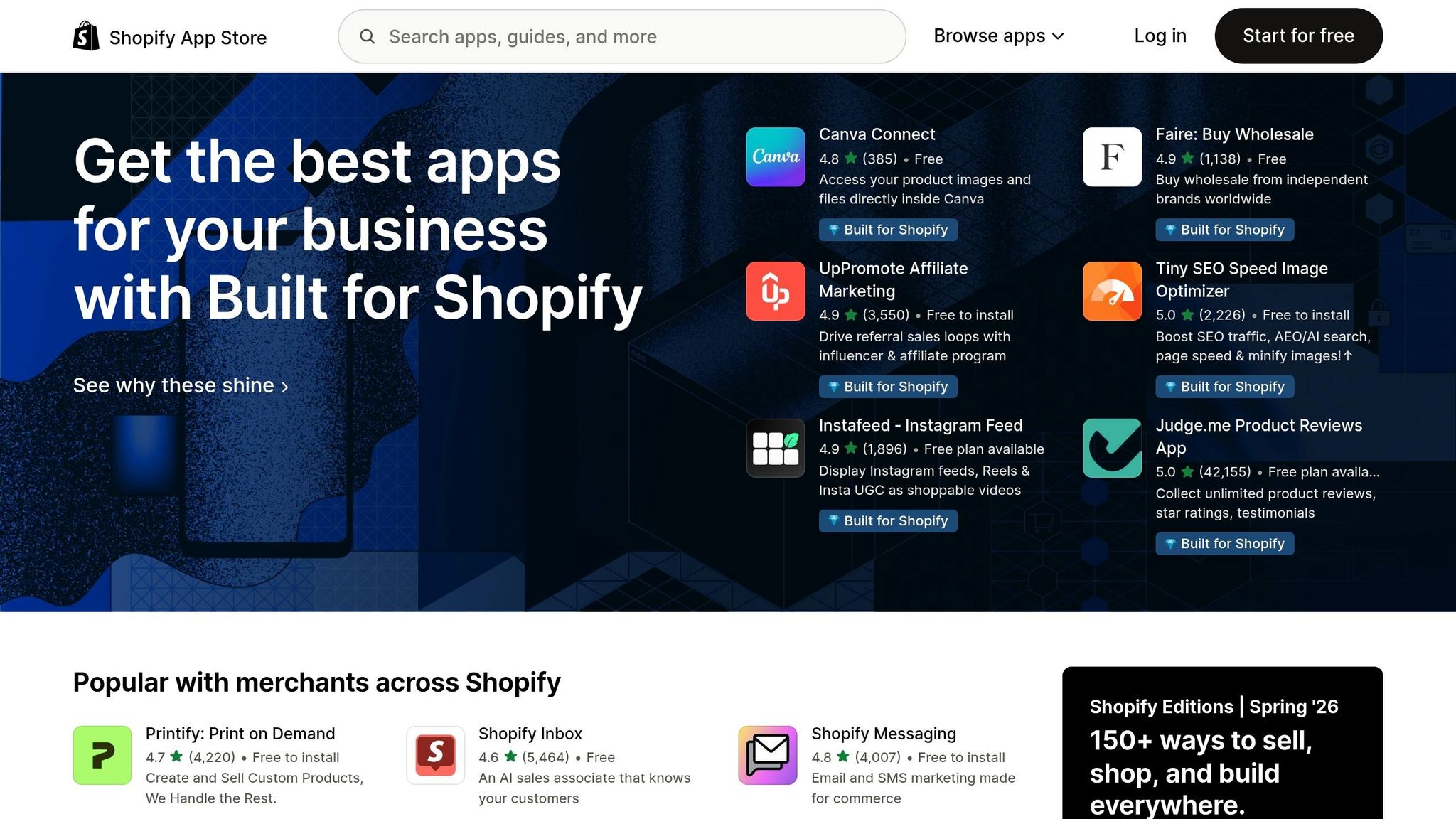
Screenshots shape the click at each step of the search, browse, and install path. In search, the first image appears next to your title and rating. In browse, it helps merchants tell similar apps apart. On the app page, it shows the app looks real and easy to use.
Merchants move fast. They scan, compare, and make a call in seconds. That means screenshot order, on-image copy, and proof points aren't small details. They're the next things that drive action.
The first 2–3 screenshots do most of the heavy lifting in tight, compressed views, so a weak opening frame can cut clicks to the detail page.
Stick to real app UI only. Merchants want to see if your tool fits into their day-to-day Shopify workflow, and abstract graphics or polished promo slides don't answer that. Clear, familiar UI sends a simple message: the app is live and maintained. Shopify says the same thing in its guidelines: logo-only screenshots are disallowed, and each image must focus on actual app functionality.
A simple order tends to work best:
- Outcome: show what the merchant gets
- Workflow: show how the app works
- Proof: show why they should trust it
That flow matches how merchants size up tools. It shortens evaluation time and cuts the friction that leads to bounces. And when your UI or key features change, update your screenshots fast so the listing never feels out of date.
1. Lead With a Benefit-First First Screenshot
Your first screenshot gets the most attention on the listing. Use it to show the outcome for the merchant, not just the feature name. It should answer one simple question: "What do I get from this app?"
Clicks and Installs
Don't open with a label like "Automated Tagging Rules." Open with the result instead: "Save hours on manual organization." Merchants often scan a few apps in a hurry, so the screenshot that explains the payoff fastest is more likely to win the tap.
A simple setup works well:
- Benefit headline
- Real UI visual
- One short proof cue
For example, you might show a clean dashboard with the overlay text "Save hours on manual organization" and a small support line like "Trusted by 8,000+ merchants." Keep that proof cue small. It should back up the main message, not fight for attention. Once the benefit lands, the rest of the gallery can walk merchants through setup and results.
Shopify Image-Rule Compliance
Keep the first image within Shopify's rules: use real app UI, show one feature or one real app state, and skip logo-only designs.
Mobile Thumbnail Readability
Build the first screenshot for thumbnail size. That means large type, strong contrast, and a simple layout. Dense UI, too many callouts, and tiny labels tend to fall apart on small screens. A headline like "Recover Abandoned Carts Faster" in bold text over a clean dashboard background is much easier to read when the image gets compressed.
One case study found that moving a key benefit into the first screenshot increased installs by 6.4%. That's why the first frame is the best place to test benefit wording before tuning the rest of the gallery.
After the opener, use the remaining screenshots to show how the app works and keep tying the flow back to the result.
2. Sequence Screenshots in a Clear Merchant Workflow
Think of your gallery like a mini funnel: hook → setup → core action → result.
Clicks and Installs
After the first image grabs attention, the rest of the gallery should show how the app gets a merchant from point A to point B. That simple flow cuts down effort and helps people make up their minds faster.
In CTR tests, screenshot sequences in a clear order tend to beat random feature lists. Why? Because they match how merchants size up apps in the first place. Instead of making someone piece the story together on their own, you show the path step by step. That removes friction and nudges them closer to an install.
For most Shopify apps, a solid sequence looks like this:
- Benefit overview
- Setup or connection
- Core workflow
- Results dashboard
- Proof or support feature
Each frame should show a clearly different screen or state. Shopify's March 2026 update added a uniqueness standard that calls for every image to show a different feature, view, or state.
Shopify Image-Rule Compliance
Each screenshot needs to show a different step from the one before it. When every frame answers a new question instead of repeating the same one, you stay in line with the rule and keep merchants moving through the gallery.
A simple gut check helps here:
- Does this show a real UI state?
- Does it show a different step than the previous screenshot?
If the answer to both is yes, you're on the right track.
Mobile Thumbnail Readability
On mobile, the first 2–3 screenshots carry most of the load. They need to work at thumbnail size, not just when opened at full size.
That usually means:
- large focal elements
- 3–5 words of overlay text
- no tiny UI details that vanish in compressed views
Merchants often decide from small previews first. So the order has to make sense before anyone taps. Start with setup, move into proof, and let the next image fill in the feature details.
3. Use Short, High-Contrast Overlay Text
Once your screenshot sequence is set, your overlay text gets about 3 seconds to prove its value. That’s not much time. Merchants move fast, so each screenshot headline needs to say what the user gets from that step.
Clicks and Installs
Keep overlay text to 3–7 words and lead with the outcome, not the feature label. For example, Save hours on sales tax tasks works better than simply naming a tool. It tells a merchant what changes for them, right away.
That kind of plain payoff text can help drive more clicks. Apps that A/B test short, benefit-led copy against text-heavy screenshots or versions with no text often see CTR gains in the 5–15% range, based on where they started. Clear overlay text cuts confusion and can support more installs.
The text should support the screenshot, not do all the work for it.
Shopify Image-Rule Compliance
Use short, factual overlay text on top of real app UI. Skip banner-style promo copy, and don’t put pricing or "free" claims inside screenshots. Straightforward, verifiable wording can help merchants trust the listing faster.
Mobile Thumbnail Readability
Put your text on a solid or semi-transparent color block so it stands apart from the UI. Think white text on deep navy, or dark text on a light panel. The goal is simple: make the words easy to read at a glance.
Design at Shopify’s required 1,600×900 px size for desktop screenshots, but always check the images at actual thumbnail size on a real phone before you publish. A layout that looks fine on a laptop can fall apart on mobile.
Use large, bold sans-serif fonts. Stick to one headline and, if needed, one short proof cue per screenshot. That makes lines like Track orders in real time readable even after compression. When text stays readable on a small screen, merchants can scan faster and are less likely to drop off.
Once the message is clear, test it at thumbnail size.
| Text Approach | Thumbnail Readability | Compliance Risk | Install Intent |
|---|---|---|---|
| Short benefit phrase, high contrast | Clear at a glance | Low | High |
| Feature label, medium contrast | Readable on desktop only | Low–Medium | Moderate |
| Dense copy, low contrast | Unreadable at small sizes | Higher | Low |
Keep text placement and styling consistent across the full gallery. That way, the screenshots feel planned instead of patched together, and merchants can scan them faster before deciding whether to tap Install.
After the copy is readable, keep each screenshot focused on one feature.
4. Show One Core Feature Per Screenshot
Once the copy is simpler, the next step is to simplify what appears inside each frame.
A busy screenshot muddies the message. One screenshot should show one core feature. When a single frame tries to explain too much, merchants can miss the point. For example, a bulk-editing app might show metafield edits in one frame and scheduled edits in the next. That keeps each frame separate, and merchants can see right away what the app does at each step.
Clicks and Installs
In thumbnail views, a single UI state with a short caption is easier to scan. That makes the value clearer and gives the listing a better shot at earning the click that leads to an install.
Shopify Image-Rule Compliance
Shopify requires each image to be unique and based on real app UI. A one-feature-per-screenshot approach lines up well with that rule because each frame stays separate and centered on the product.
Mobile Thumbnail Readability
Single-feature layouts give the main UI more room, so the key action stands out fast.
| Screenshot Type | Thumbnail Clarity | Install Intent |
|---|---|---|
| One feature, real UI, short caption | High | High |
| Two features, split layout | Moderate | Moderate |
| Multiple features, dense UI | Low | Low |
With each screenshot centered on one feature, the gallery is ready to use proof to build trust. Next, show real UI states that prove the feature works in practice.
sbb-itb-ce93587
5. Design for Mobile-Friendly Readability
Once each screenshot focuses on a single feature, the next job is simple: make that message easy to read on a phone. Mobile screenshots need to land fast. Use large, high-contrast headlines and crop tight around the main UI state. The headline should be readable without pinching or zooming.
Clicks and Installs
Readable screenshots carry the same benefit story across the rest of the gallery. When a merchant can connect a screenshot to a clear result or task right away, they’re more likely to keep swiping and get closer to install. If they have to zoom in or puzzle it out, they’ll skip past it.
Use high-contrast text on a solid background so captions stay sharp on bright screens. Small details get lost fast on mobile. Clear thumbnails keep merchants swiping; hard-to-read ones kill the click.
Shopify Image-Rule Compliance
The same choices help with approval too. Shopify requires real, unique app UI screenshots at 1,600×900 px. A simple frame that shows one UI state is easier to read and easier to approve. Multi-panel frames tend to look cramped on phones, and that hurts clarity.
Stick with:
- Large text
- One UI state per screenshot
- High contrast
- No full-dashboard views
- No multi-panel layouts
Before you publish, test every screenshot on an actual phone. If the layout reads cleanly on mobile, then use real UI states to show the feature in action.
6. Add Proof Points Through Real UI States
Once the screenshot is easy to read, use the frame to show the app is live. The key is simple: use a real UI state, not a mockup. A screen that shows "12 orders synced," a live automation rule, or a dashboard with actual metric labels does more than a generic marketing line ever could. It turns a claim into proof.
CTR and Install Intent
Real UI states cut one of the biggest points of friction in the install decision: uncertainty. People want to see results, not just features. That’s why a setup completion screen, a saved rule, or a results dashboard can work so well.
The data also needs to feel believable. Empty charts and inflated numbers can backfire. A dashboard showing "1,247 orders synced" feels credible. "9,999,999 orders synced" doesn’t. That kind of realism can lower hesitation and help improve click-through.
Shopify Image-Rule Compliance
Each image needs to show a different UI state. Don’t recycle the same dashboard and just swap in a new headline. And don’t put pricing, review stars, or outcome guarantees inside the images.
Instead, put the proof inside the interface itself. That could mean:
- a realistic metric inside a dashboard
- a status badge showing "automation enabled"
- a sync confirmation screen
Mobile Thumbnail Readability
Dense dashboards packed with tiny numbers fall apart on phones. At thumbnail size, the proof needs to be easy to spot. Stick to one clear metric, one status, or one before-and-after state.
Keep those proof states aligned across the gallery, then refine them with performance data.
7. Keep Visuals Consistent and Refine With Data
Once the gallery is in the right order, easy to read, and backed by proof, use one consistent template to tie everything together.
A gallery with the same visual system looks polished and is easier to scan. When every screenshot uses the same color palette, typography, icon style, and layout grid, merchants can move through the listing faster and feel more confident in what they’re seeing. Keep the structure fixed - the same main brand color, the same headline placement, the same device mockup style - and change only the content inside that template. That kind of consistency helps the listing feel trustworthy and can support both click-through rate and install intent.
Compliance With Shopify Image Rules
A shared template also helps keep screenshots within Shopify’s image rules: real UI, correct aspect ratio, and distinct states.
Mobile Thumbnail Readability
Check each screenshot at thumbnail size. If the message fades out or gets lost, simplify the layout.
Iterating With Data
Once your template is set, change one variable at a time - like a headline, a proof label, or a highlighted UI module - so you can tell what’s moving performance.
According to AppJubilee's listing-change impact data, optimized listing updates produce an average ranking improvement of 8.3 positions, and ranking shifts typically become visible within 7 days of a change.
Log each screenshot update in AppJubilee and compare it against CTR, installs, and keyword movement. Track every screenshot change so your next test shows which visual tweak led to more clicks and installs.
Quick Reference Table: High-Impact vs. Low-Impact Screenshot Choices
Use this table as a quick audit tool. Check each row before you publish or update your listing. If any of your current screenshots land in the low-impact column, that frame likely needs work.
| Screenshot Element | High-Impact Choice ✅ | Low-Impact / Risky Choice ❌ | Why It Matters |
|---|---|---|---|
| First Screenshot Focus | Benefit-first; states the merchant outcome fast | Generic dashboard view, logo splash, or settings panel with no benefit callout | First frame must make value clear right away |
| Overlay Text Length | 3–7 words, benefit-led, such as "Recover abandoned carts automatically" | Multi-line copy or feature lists | Dense text is hard to read at mobile preview size |
| Font Readability | Large, bold sans-serif type with high contrast, readable at thumbnail size | Thin script fonts, light gray on white, or text over a busy UI background | If text is hard to read, people are less likely to scan or click |
| Feature Coverage | One core feature per screenshot with a zoomed-in, realistic UI view | Crowded dashboard view with multiple elements | A focused frame is easier to process and helps build a clear sequence |
| Proof Approach | Real UI states with specific, UI-backed metrics, such as "Abandoned checkout recovery rate: 18%" | Vague claims like "Boost sales fast!" or inflated numbers without visual evidence | Grounded proof builds trust and supports install intent |
| Mobile-Friendly Layout | Critical text centered or in safe zones, tested at thumbnail size | Desktop-only captures with tiny sidebar labels carrying the main message | When key messages disappear on smaller screens, the listing does less work |
| Compliance | Real UI only, correct format, no pricing/review/guarantee claims | Logo-only frames, fabricated data, or screenshots implying features the app doesn't have | Non-compliant visuals can trigger listing review issues and hurt trust |
Use this checklist to spot weak frames. Then test changes in AppJubilee to see which version improves CTR and installs.
Using ASO Data to Refine Screenshot Performance
Once your screenshots are live, the work isn’t done. That’s when testing starts.
Screenshot performance changes over time, and so do CTR, installs, and rankings. If you want to know which frame is doing its job, you need to look at the data after each update.
Use ASO data to see which screenshot change had an impact. AppJubilee tracks how keyword rankings, CTR, and installs respond after a screenshot update. That way, each test is tied to a measurable result instead of a design opinion.
Focus on a few core signals:
- CTR
- Installs per 1,000 impressions
- Keyword rankings
A low CTR on a page-one ranking usually points to a weak first impression. In plain English, your first screenshot may need a clearer benefit, stronger proof state, or both.
You should also keep an eye on competitor moves. AppJubilee’s App Watch feed sends alerts when competitors update their listings, including screenshots. That makes it easier to spot gallery changes that may affect your shared keywords.
If a rival updates its gallery, don’t just note it and move on. Use that moment to test a clearer first screenshot or a stronger proof state and see how your numbers respond.
Conclusion
These seven tips work best when they work together. The goal is simple: make your screenshots clearer, easier to scan, and more convincing at a glance.
Use screenshots to show value fast, in the right order, and in a format merchants can read on any device.
Start with the result. Then walk through the workflow, highlight one feature at a time, and add proof in a readable, mobile-first sequence. Once the gallery feels clear, check each change against performance data.
Use AppJubilee to track how every screenshot update affects CTR, installs, and rankings. Keep the version that wins, then keep refining from there.
The goal is a clearer gallery with every test.
FAQs
What should my first screenshot say?
Your first screenshot should spell out your main value prop and the core merchant problem your app solves.
Use action-driven language that puts the benefit front and center. Instead of a generic label like cart recovery, say Recover abandoned carts before customers leave for good. That makes the value clear and can improve click-through rate.
How do I make screenshots readable on mobile?
Keep screenshots clean and uncluttered, with the main value prop front and center. Use large, high-contrast text overlays to call out specific features instead of leaning on tiny UI details that can vanish on smaller screens.
Stick to one key benefit per slide. Then check each screenshot in mobile view to make sure the text and UI still look clear and easy to read.
How can I test if new screenshots improve installs?
Track listing updates against performance data. In AppJubilee, Change Impact Tracking saves a snapshot every time you edit your listing, which makes it easy to compare versions side by side.
From there, you can watch keyword rankings and install trends over the next 3, 7, and 14 days to see if the new screenshots improve visibility and conversion.